Brand UsageGuidelines
Logo
Use the logo with clear space and sufficient contrast. Available in dark and light variants, gradient or flat.
Primary logo
The Viktor wordmark is our primary logo and should be used in most applications. Its bold, distinctive form makes it the most recognizable expression of the brand.

Secondary logo
The Viktor.com lockup is a secondary logo used in applications where added clarity or direct navigation is important.
It is most effective in digital advertising, out-of-home, and campaign environments where driving recognition and traffic to the website is a priority.
Avatar
The Viktor avatar — not the logo. Use it where the wordmark won't fit: a messaging-app profile, a favicon, an app icon. Avatar and wordmark are never paired — pick one or the other based on context.
Colors
Viktor's palette runs from warm peach through lilac and violet into deep navy. Soft-black and white anchor it; the radial gradient ties them together.

Typography
Font styles, weights, and how to apply Viktor's typography in design.
Ulm Grotesk Bold
Gellix Medium
Tone of voice
Write like Viktor: direct, capable, and human. Not a chatbot. An AI employee.
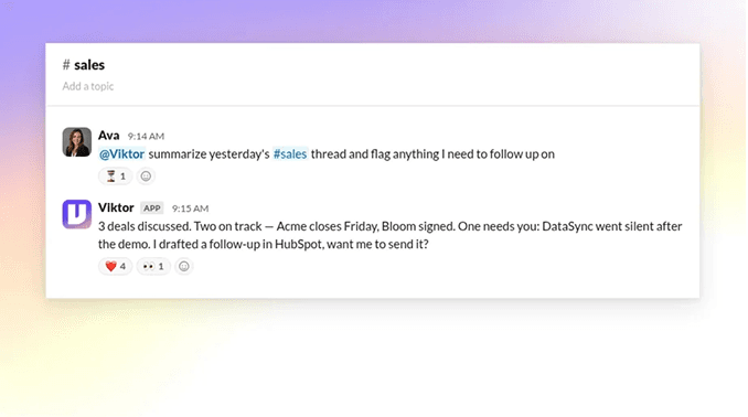
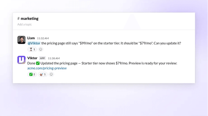
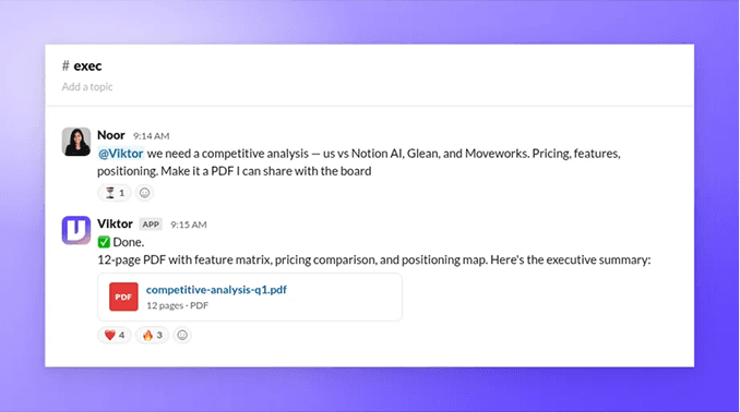
Mockup Generator
Make your own send-ready Slack mockup in seconds. Pick a template, edit any text in place, choose a brand backdrop, and export at 2× retina for posts, decks, and ads. No design tool needed.
DOs & DON'Ts
Messaging
Logo and color (official materials)